CLIENT
The Metropolitan Museum of Art
PROJECT
Ticket kiosk updates
ROLE
UX/UI Designer
RESPONSIBILITIES
Research, user flows, wireframes, prototyping, QA
The challenge
In 2015, the Metropolitan Museum of Art introduced ticket kiosks into the Great Hall in order to handle the influx of daily visitors and alleviate the ticket staff. In 2017, the Met welcomed 7 million visitors across its three locations. International visitors accounted for 37% of the Museum’s attendees and there were only 14 ticket kiosks located in the Great Hall.
Now in 2018, the ticket kiosks account for the majority of tickets used to gain entry into the museum, either through online purchases, member tickets, or standard full-price ticket sales for out-of-state residents. As the new admissions policy began to take effect—only allowing NY residents and Tri-state area students to “pay what you wish”—the kiosks would see a further increase in usage. It was important that we optimize the kiosks so that the visitors could get their tickets quickly and enjoy their museum experience.
When I joined the the Met’s Transactions team at the start of 2018, they had originally planned to refresh the entire kiosk interface, but knowing it would take several months to roll out, the team decided to make a series of updates to the current design before taking on that endeavor. This would allow us to improve the kiosk, while giving us time to work on the needs of the website.

The Great Hall and its thousands of daily visitors.
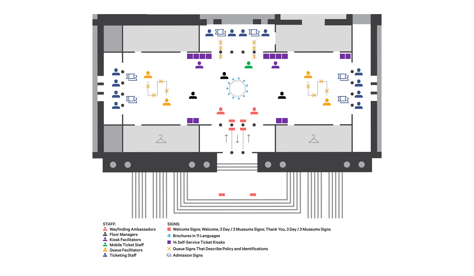
Great Hall kiosk floor plan (NYT).
Our process
Our team worked in an agile environment. We implemented these kiosk updates in many 2-week sprints over a 6-month time period. The product manager served as the product owner and created user stories based on meetings with stakeholders, user research, and analytics. The core team consisted of a Product Manager, Lead Application Developer, Front End Developer, QA Specialist, and several Back End Developers, all of whom I worked very closely with. I was the team’s dedicated UX/UI Designer and was responsible for research, user flows, wireframes, prototypes, finished designs, annotations, and QA. I have consolidated all the updates into one story in order to present the overall improvement of the kiosk.
Research
At the Met I had the luxury of observing visitors using the ticket kiosks by simply taking the elevator down to the Great Hall from our upstairs office. I also spoke with several of the kiosk facilitators. Kiosk facilitors are assigned to a group of kiosks and make sure that visitors are able to transact without any problems. Additionally, our team frequently met with stakeholders to gather information on how visitors were interacting with the kiosks and ticket staff. Here’s what we learned:
- Visitors were not able to immediately identify their course of action on the homescreen.
- On the Payment screen, visitors would not “dip” the card as instructed. Instead, they would leave the card inserted and wait to receive an error message.
- On the Collect Tickets screen, visitors would select the “Finish” button very quickly without reading the message and knowing where the tickets printed, causing them to look around confused for a few seconds.
- Visitors who had purchased many tickets found the scanning process, as well as saving tickets for a later date to be cumbersome.
- Stakeholders reported to us that audio guide sales were not as high as they liked them to be.
- Stakeholders also requested that the visitor survey be updated to capture information pertinent to the new admissions policy.
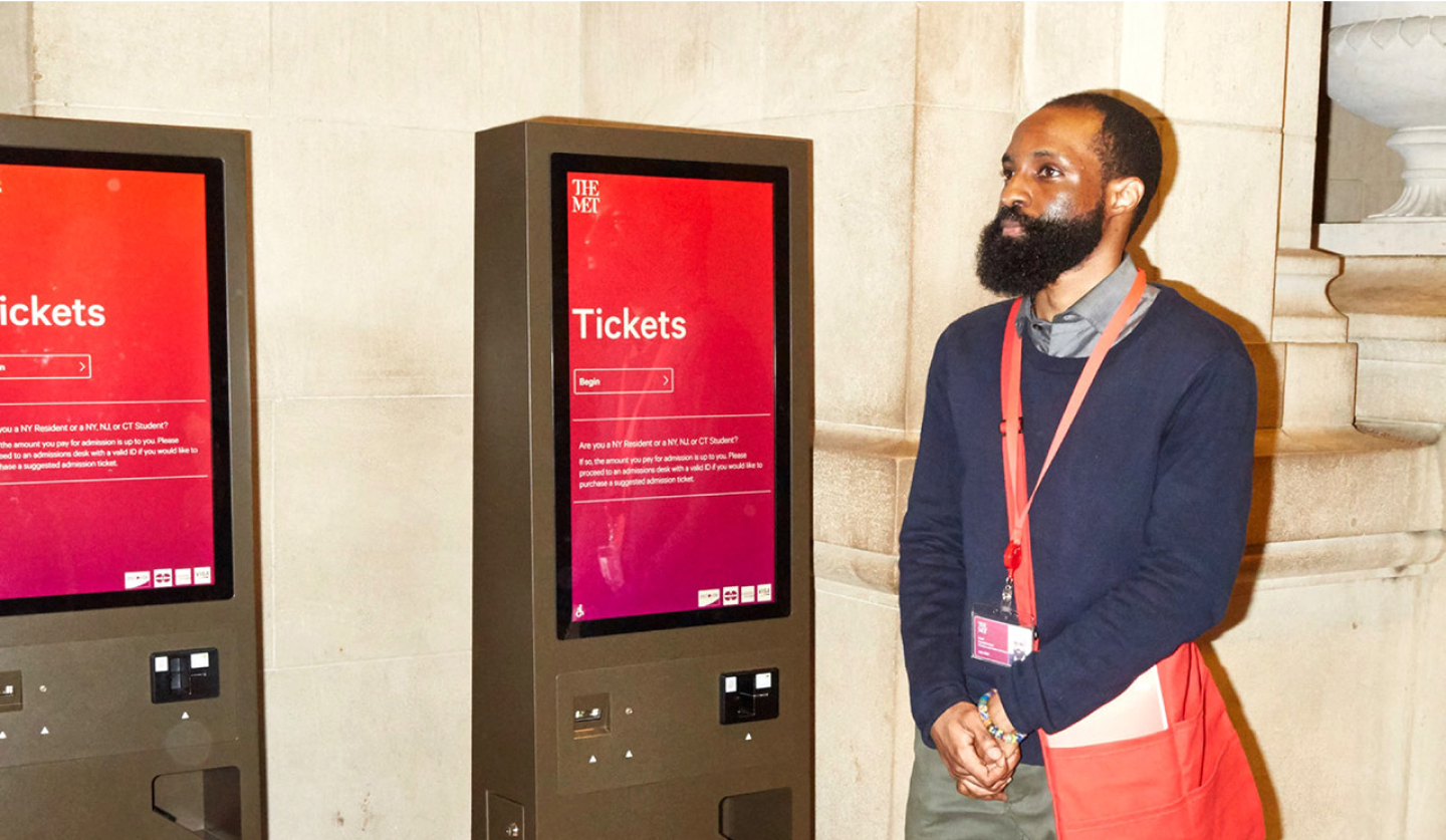
Kiosk facilitator standing by his station.
Reducing cognitive load on the homescreen
At the time, the current homescreen consisted of 6 tile buttons, each with equal weight. Our goal was to give more attention to purchasing General Admission tickets, since that was the most common task by far.

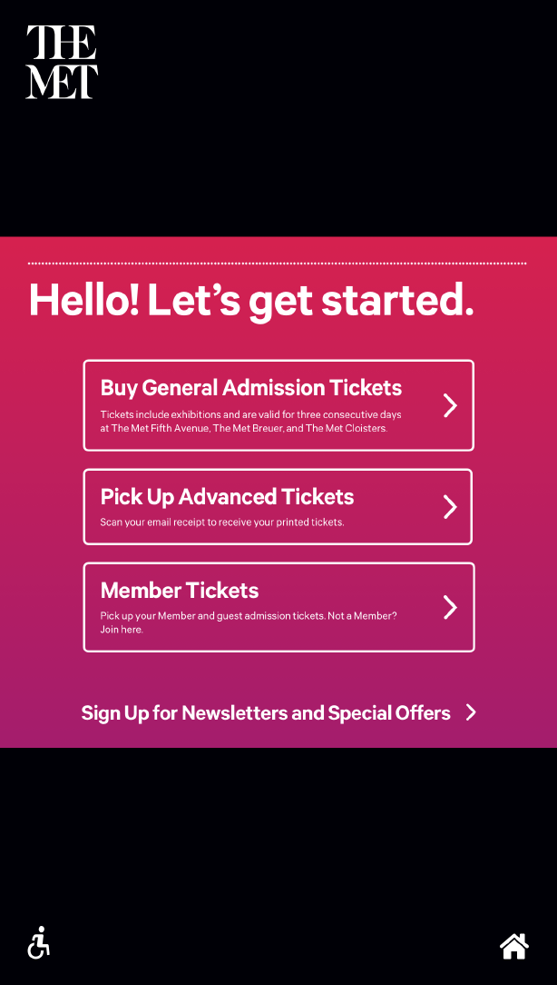
The homescreen before being redesigned.
Our team had decided to remove the MetLiveArts button from the lower right of the homescreen. MetLiveArts allowed visitors to purchase tickets to live performances at the Met, however the events on the kiosk were not regularly updated and selecting it as an option would sometimes return an empty list. In order to keep transaction time on the kiosks to a minimum, we also wanted to remove any possible browsing behavior, which was better suited for the online website.
Additionally, we wanted to reduce the “Sign Up for Email” button in the lower left. Even by having the button so prominent and giving it equal weight to the General Admission button, the numbers for email sign up were fairly insignificant. The button was taking up valuable real estate and not producing results. We decided to move the button below all the buttons and change it to a text link. This helped lower the button in hierarchy, while differentiating it from the core functions that were guaranteed to be selected frequently.
Here are several iterations of the homescreen that were designed:

Version 1: Equal Weight
Version 2: List View

Version 3: Mosaic
In our final design, we reduced the number of tile options by half. The General Admission button is now twice as big as any other option, and very clearly stands out as the top option at a quick glance. “Redeem Web Tickets” and “CityPass” were combined into one button that simply read “Pick Up Tickets”.
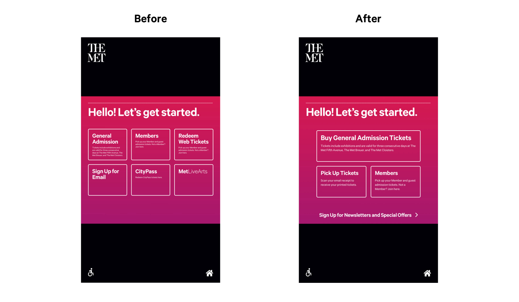
The original homescreen (left) and the new homescreen (right).
Simplifying the General Admission page
The General Admission page had always felt a bit cluttered. The admissions policy had to be explained very carefully and thus took up a lot of space. We observed visitors go through the General Admission page very quickly without considering the audio guide, and stakeholders mentioned that they would like to see audio guide sales improve.
We decided to separate the General Admission tickets and the Audio Guides into two different pages. Although an additional step was now part of the checkout flow, the separated information was more focused and easier to understand. The dedicated Audio Guides page also allowed room for a short text explainer, and caused the visitor to pause for a moment longer and consider the value of the purchase.

The General Admission page gets broken down into 2 steps.
Adding partial and full order redemption using only one QR code
We received feedback from ticket staff that visitors would sometimes save tickets for later, and wanted a way to make saving tickets easier. For instance, a group may plan a trip to visit the museum ahead of time and maybe everyone isn’t able to make it. Sometimes people like to buy a bunch of tickets for themselves all at once. The current system allowed the visitor to save QR codes for later, but all the QR codes were listed in one email, leaving room for error upon future visits. For example, on the next trip to the museum, the visitor would have to remember which QR codes were scanned and which were not.
Scanning each QR code for a bulk order was cumbersome in itself. Scanning QR codes was tricky to get right the first time and often asked for the help of the Kiosk Facilitators. If someone had purchased 5 tickets for their family, there was no way to redeem all tickets at once and each QR code in the email receipt would have to be scanned individually.

The advanced ticket email, before and after kiosks implemented partial redemption.
Our team decided to reduce all ticket orders to one QR code, no matter how many tickets were purchased. Once the QR code was scanned, the visitor would be able to see their ticket balance and choose how many they would like to redeem. The same QR code could be used to redeem tickets at a later date.

A wireflow showing the two different ways to redeem tickets: redeem full order (top) and redeem partial order (bottom)

Partial order redemption explorations.
Above are many of the explorations I created for the screen in which the visitor would select the quantity of tickets to print. The first version replicates the way that general admission tickets were sold. In other versions I am playing with the number and order of columns, as well as trying a list contained within a box to further differentiate the visitor's selections. Below are the final versions of the partial order redemption screens.

Step 1: Scan QR code on email.

Step 2: Select “Redeem Partial Order”.

Step 3: Select # of tickets to print.
Adding animation to help guide the visitor
Visitors were prone to skimming through instructions on the kiosk as they rushed to get into the museum. On the Payment screen, the visitor was instructed to “dip” their credit card, along with an illustration pointing to the credit card slot on the kiosk. Many visitors would still just leave their credit card in the slot, prompting an error.
When a payment was successfully processed, the visitor was then taken to the Collect Tickets screen, which displayed an illustration of where the printed tickets would be located. Sometimes the visitor would select the “Finish” button very quickly after skimming the page, causing them to look around confused for a couple seconds.
To help guide the visitor on these key screens, we tweaked the language and added animation to the illustrations. On the Payment screen we changed “dip” to “insert and remove” and animated the card so that it went in and out of the card slot quickly. On the Collect Tickets page we animated the ticket in the pop-up so that it slowly descended into frame as if it were being printed. Although these were both very minor adjustments that may seem pretty insignificant, they were both successful in getting visitors to pause and think for a moment, and be more conscious of the instructions.
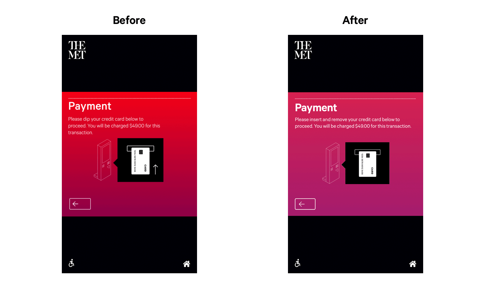
Static graphic (left) and animated graphic with updated copy, "insert and remove" instead of "dip" (right).

Static graphic (left) and animated graphic of ticket printing (right).
A new visitor survey
Half of the visitors using the kiosk would see a one question survey. The survey was a way for the museum to learn more about its visitors and make improvements to the museum accordingly. The museum's ability to cater to many different nationalities is extremely important, and so the original survey asked what country the visitor was from.
With the new policy change, the visitor information the Met wanted to gather had changed slightly. The new survey was more focused on U.S. visitors and whether or not they were from the Tri-state area—or if they were simply international. Although it would have been nice to capture as much information as possible, it was crucial that we didn't add too much time for each kiosk transaction.

Gathering new information with the Visitor Survey.
Reflection
This is just one example of how our team worked day to day and made research informed decisions. Our team was very much about small wins that add up to one big win. We didn’t overhaul the kiosk and make drastic changes to the user flows or design system—we made small improvements while working within constraints—balancing the amount of time for each role in a 2-week sprint, the limitations of the backend code, the legal copy, and coordinating all the time spent collaborating and handoffs. It was also extremely important that every update was thoroughly QA tested before and after deploying.
I am very proud of the work that was done on the kiosk and it was a lot of fun. It’s not too often that one gets to work on a custom platform that will be used by millions of people each year. Every interaction is so important and needs to be understandable from people of all ages and nationalities. In the bigger picture, saving a few seconds from the thousands of people that use the kiosks each day adds up to hundreds of hours saved over the course of a year.

